Designing an AI Agent Beta Product
Driving Adoption and Usability
Project Overview
Gaddr is a startup and comprehensive AI agent platform built to automate business processes across project management, marketing, HR, and more. I clarified user needs and helped design for the beta product launch.
I created key design artifacts such as an MVP scope, information architecture, sitemap, user flows, wireframes, a design system and an UI to streamline collaboration, establish structure, and support scalable product growth.
Problem
To create a beta product amid unclear vision, shifting requirements and lack of structure, causing misalignment and inefficient feature prioritization.
Solution
I introduced design processes and key UX artifacts to align the team, clarify the product vision, and shape early ideas into a structured, testable beta product.
Client
Gaddr, a comprehensive AI agent platform covering multiple business functions.
Users
Business owners, project managers, HR, marketing teams and personal assistants automating processes.
Research
Benchmarking
Usability testing
A/B testing
Personas
Define
MVP
Information architecture
Sitemap
User flow diagram
Design
Wireframing
Interaction design
Design system
Style guide
UI
Impact
80% of beta users understood the app’s purpose and core features.
Indicates that the initial UI effectively communicated the product’s value.
60% of beta users tested at least one AI automation feature.
Showing strong early engagement with the platform’s key functionality.
25% of users provided actionable feedback for future improvements.
Demonstrates an active and invested user base helping to shape the product roadmap.
Average session length: 8–12 minutes per user during beta testing.
Reflects meaningful interaction time, suggesting users found value in exploring the app.
85% of users rated the prototype as “usable” in usability tests.
Confirms that the design met a high standard of usability even at this early stage.
Project start
The brief
I was tasked with translating the founder’s concept into a structured, fully functional beta product ready for real user testing and feedback.
Required features
Main dashboard with chat
AI agent dashboard
Task management
Knowledge base management
Meeting assistant
Analytics dashboard
Calendar management
Budget management
Settings
My role
To improve collaboration, structure, and support scalable growth.
I created core design artifacts i.e. MVP scope, IA, sitemap, flows, wireframes, design system, and a UI.
Research
Defining navigation, interactions, and constraints
I benchmarked AI agent platforms to understand user expectations around navigation, onboarding, and AI interactions. This revealed two core input models, chat-based and workflow-based, leading us to support both for flexibility and structure.
I interviewed internal stakeholders to validate early design assumptions and align on technical constraints. A user persona was created to represent a key HR user, ensuring the design addressed real needs like automation and decision-making. These insights shaped our initial design approach and testing priorities.
Define
Setting product structure and design process
To establish a design process and put a clear roadmap in place, I defined the MVP, created the information architecture and helped develop a sitemap to organise the product content and map key user flows to create a clear navigational structure.
I introduced regular design reviews and stakeholder meetings to align the team, surface issues early, reduce friction in collaboration and build a shared understanding of the product structure and user journey.
Key iterations
Agent Creation Wizard: added to guide users through setting up an AI agent step-by-step.
App Integrations: introduced private (user-only) and shared (org-wide) options.
Token & Budget Management: initially subscription-only, added per-project token purchases.
Chat Feature: expanded from a single default AI agent to include task-specific agents.
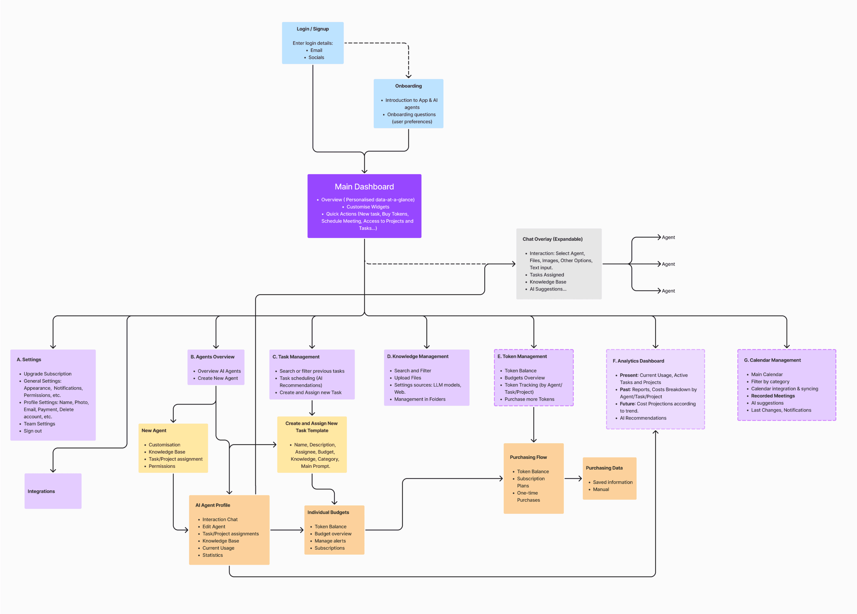
Sitemap created by other team member, iterated on by all
Design
Designing a smooth user experience
Based on early research and product goals, I created low-fidelity wireframes to define layout, user flows, and content hierarchy.
Key areas included:
• A customizable dashboard to surface key task information.
• Task orchestration and agent chat for managing automated workflows.
• Login, signup, and settings to support smooth user access and control.
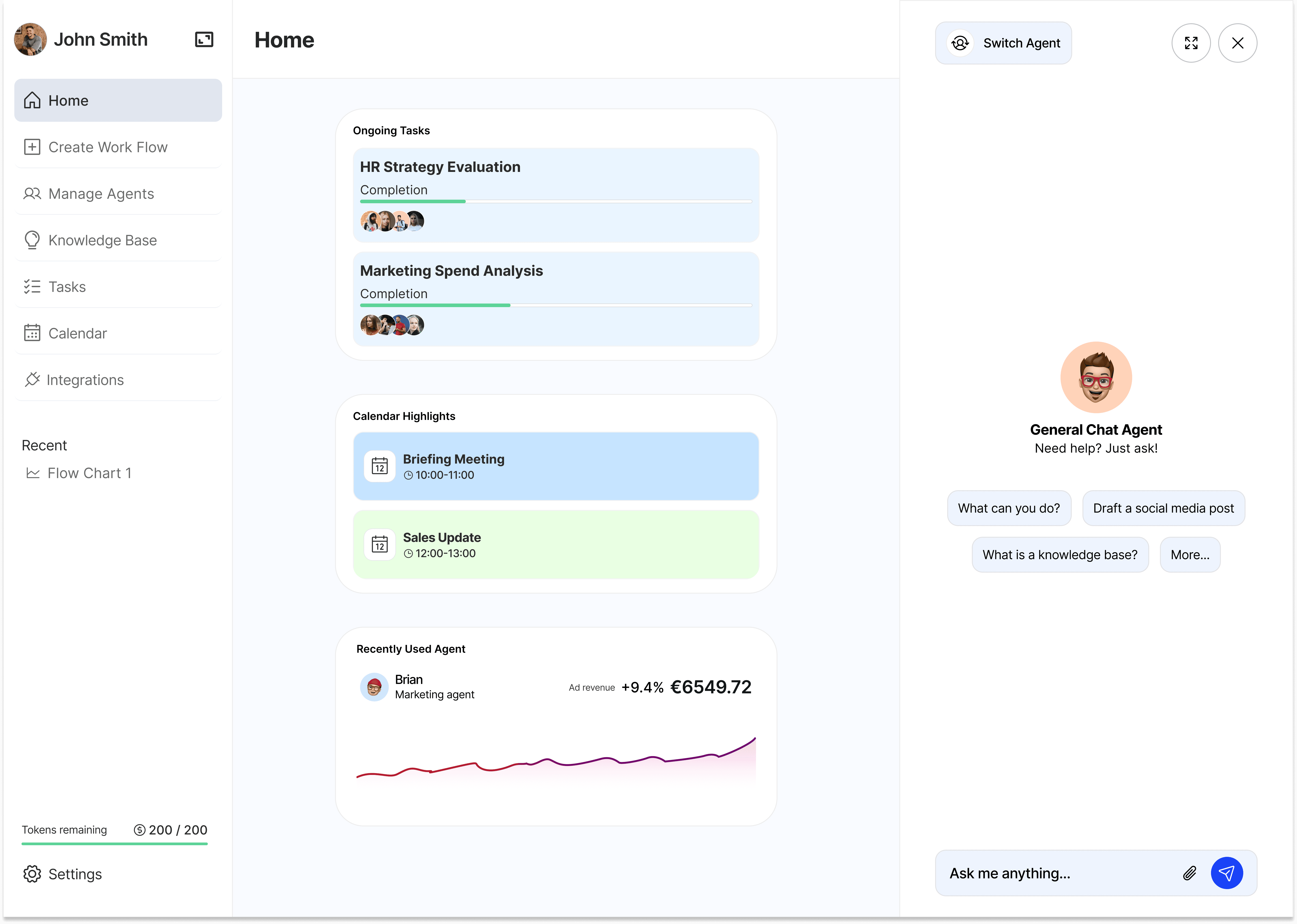
I introduced a design system and component library to bring consistency and scalability to the UI. Feedback helped refine interactions, improve usability, and shape a navigation model that scaled across the product. The final dashboard balanced clarity and customization, enabling users to quickly access key information and tailor their view to fit their needs.

Main dashboard with customizable widgets showing upcoming events, tasks etc.
Priority tasks and calendar highlighted giving user most relevant info at a glance.
Chat pane opens on right side, giving quick access to chat input.
Widgets resize to reduced screen size keeping priority info visible for easy multitasking.
First iteration
The first iteration of the agent chat had the pop up window as an overlayover the main dashboard to focus user attention, as shown below.
After team review, we shifted to a less intrusive layout that allowed users to view the dashboard and chat simultaneously, better supporting multitasking.

First iteration chat window. Decided this was too intrusive.
Key info blocked.
Impact
80% of beta users understood the app’s purpose and core features.
Indicates that the initial UI effectively communicated the product’s value.
60% of beta users tested at least one AI automation feature.
Showing strong early engagement with the platform’s key functionality.
25% of users provided actionable feedback for future improvements.
Demonstrates an active and invested user base helping to shape the product roadmap.
Average session length: 8–12 minutes per user during beta testing.
Reflects meaningful interaction time, suggesting users found value in exploring the app.
85% of users rated the prototype as “usable” in usability tests.
Confirms that the design met a high standard of usability even at this early stage.
Conclusion
Handoff & reflection
As I wrapped up my time on the project, I handed over a solid foundation of assests and processes, including a detailed UI, wireframes, a developing design system, and clear documentation of user flows and requirements. These assets were designed to ensure consistency, speed up decision-making, and support future design work and iteration.
The next steps would be to continue testing the designs with users to validate key flows and identify early pain points. From there, I would have moved to design any additional features, expanded the component library, and continued usability testing and checking metrics to refine interactions based on feedback before full scale development.
My goal was to leave the team with a clear, scalable foundation to build on and I believe that was achieved. I was proud to see the project brought to life from an unclear concept to a tangible product and UI setting the stage for future evolution as the company grows.
Thanks for reading
Let's connect!
© Conor Walls 2025
Designing an AI Agent Beta Product
Driving Adoption and Usability
Project Overview
Gaddr is a startup and comprehensive AI agent platform built to automate business processes across project management, marketing, HR, and more. I clarified user needs and helped design for the beta product launch.
I created key design artifacts such as an MVP scope, information architecture, sitemap, user flows, wireframes, a design system and an UI to streamline collaboration, establish structure, and support scalable product growth.
Problem
To create a beta product amid unclear vision, shifting requirements and lack of structure, causing misalignment and inefficient feature prioritization.
Solution
I introduced design processes and key UX artifacts to align the team, clarify the product vision, and shape early ideas into a structured, testable beta product.
Client
Gaddr, a comprehensive AI agent platform covering multiple business functions.
Users
Business owners, project managers, HR, marketing teams and personal assistants automating processes.
Research
Benchmarking
Usability testing
A/B testing
Personas
Define
MVP
Information architecture
Sitemap
User flow diagram
Design
Wireframing
Interaction design
Design system
Style guide
UI
Impact
80% of beta users understood the app’s purpose and core features.
60% of beta users tested at least one AI automation feature.
25% of users provided actionable feedback for future improvements.
Average session length: 8–12 minutes per user during beta testing.
85% of users rated the prototype as “usable” in usability tests.
The brief
I was tasked with translating the founder’s concept into a structured, fully functional beta product ready for real user testing and feedback.
Required features
Main dashboard with chat
AI agent dashboard
Task management
Knowledge base management
Meeting assistant
Analytics dashboard
Calendar management
Budget management
Settings
My role
To improve collaboration, structure, and support scalable growth.
I created core design artifacts i.e. MVP scope, IA, sitemap, flows, wireframes, design system, and a UI.
Research
Defining navigation, interactions, and constraints
I benchmarked AI agent platforms to understand user expectations around navigation, onboarding, and AI interactions. This revealed two core input models, chat-based and workflow-based, leading us to support both for flexibility and structure.
I interviewed internal stakeholders to validate early design assumptions and align on technical constraints. A user persona was created to represent a key HR user, ensuring the design addressed real needs like automation and decision-making. These insights shaped our initial design approach and testing priorities.
Define
Setting product structure and design process
To establish a design process and put a clear roadmap in place, I defined the MVP, created the information architecture and helped develop a sitemap to organise the product content and map key user flows to create a clear navigational structure.
I introduced regular design reviews and stakeholder meetings to align the team, surface issues early, reduce friction in collaboration and build a shared understanding of the product structure and user journey.
Key iterations
Agent Creation Wizard: added to guide users through setting up an AI agent step-by-step.
App Integrations:
introduced private (user-only) and shared (org-wide) options.
Budget Management:
initially subscription-only, added per-project token purchases.
Chat Feature:
expanded from a single default AI agent to include task-specific agents.

Sitemap created by other team
member, iterated on by all.
Design
Designing a smooth user experience
Based on early research and product goals, I created low-fidelity wireframes to define layout, user flows, and content hierarchy.
Key areas included:
• A customizable dashboard to surface key task information.
• Task orchestration and agent chat for managing automated workflows.
• Login, signup, and settings to support smooth user access and control.
I introduced a design system and component library to bring consistency and scalability to the UI. Feedback helped refine interactions, improve usability, and shape a navigation model that scaled across the product. The final dashboard balanced clarity and customization, enabling users to quickly access key information and tailor their view to fit their needs.
Main dashboard with customizable widgets
showing upcoming events, tasks etc.
Chat pane opens on right.
Widgets are responsive.
First iteration
The first iteration of the agent chat had the pop up window as an overlayover the main dashboard to focus user attention, as shown below.
After team review, we shifted to a less intrusive layout that allowed users to view the dashboard and chat simultaneously, better supporting multitasking.
First iteration chat window.
Decided this was too intrusive.
Impact
80% of beta users understood the app’s purpose and core features.
Indicates that the initial UI effectively communicated the product’s value.
60% of beta users tested at least one AI automation feature.
Showing strong early engagement with the platform’s key functionality.
25% of users provided actionable feedback for future improvements.
Demonstrates an active and invested user base helping to shape the product roadmap.
Average session length: 8–12 minutes per user during beta testing.
Reflects meaningful interaction time, suggesting users found value in exploring the app.
85% of users rated the prototype as “usable” in usability tests.
Confirms that the design met a high standard of usability even at this early stage.
Conclusion
Handoff & reflection
As I wrapped up my time on the project, I handed over a solid foundation of assests and processes, including a detailed UI, wireframes, a developing design system, and clear documentation of user flows and requirements. These assets were designed to ensure consistency, speed up decision-making, and support future design work and iteration.
The next steps would be to continue testing the designs with users to validate key flows and identify early pain points. From there, I would have moved to design any additional features, expanded the component library, and continued usability testing and checking metrics to refine interactions based on feedback before full scale development.
My goal was to leave the team with a clear, scalable foundation to build on and I believe that was achieved. I was proud to see the project brought to life from an unclear concept to a tangible product and UI setting the stage for future evolution as the company grows.
Thanks for reading
Let's connect!
© Conor Walls 2025