Designing a prototype for Investment pitching.
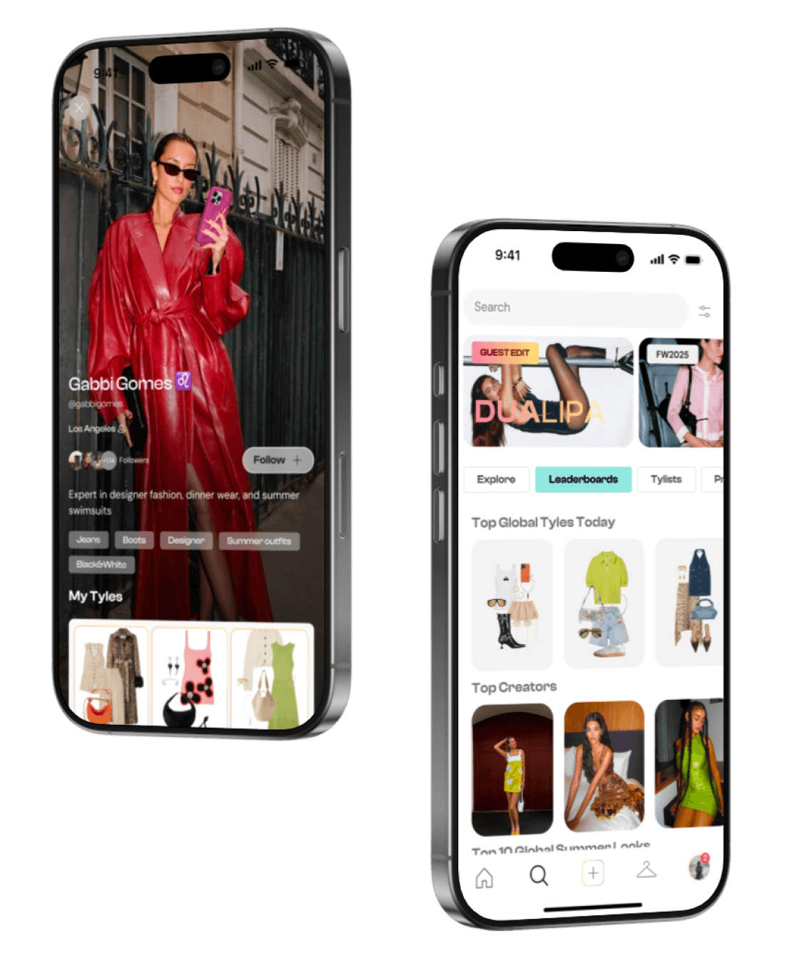
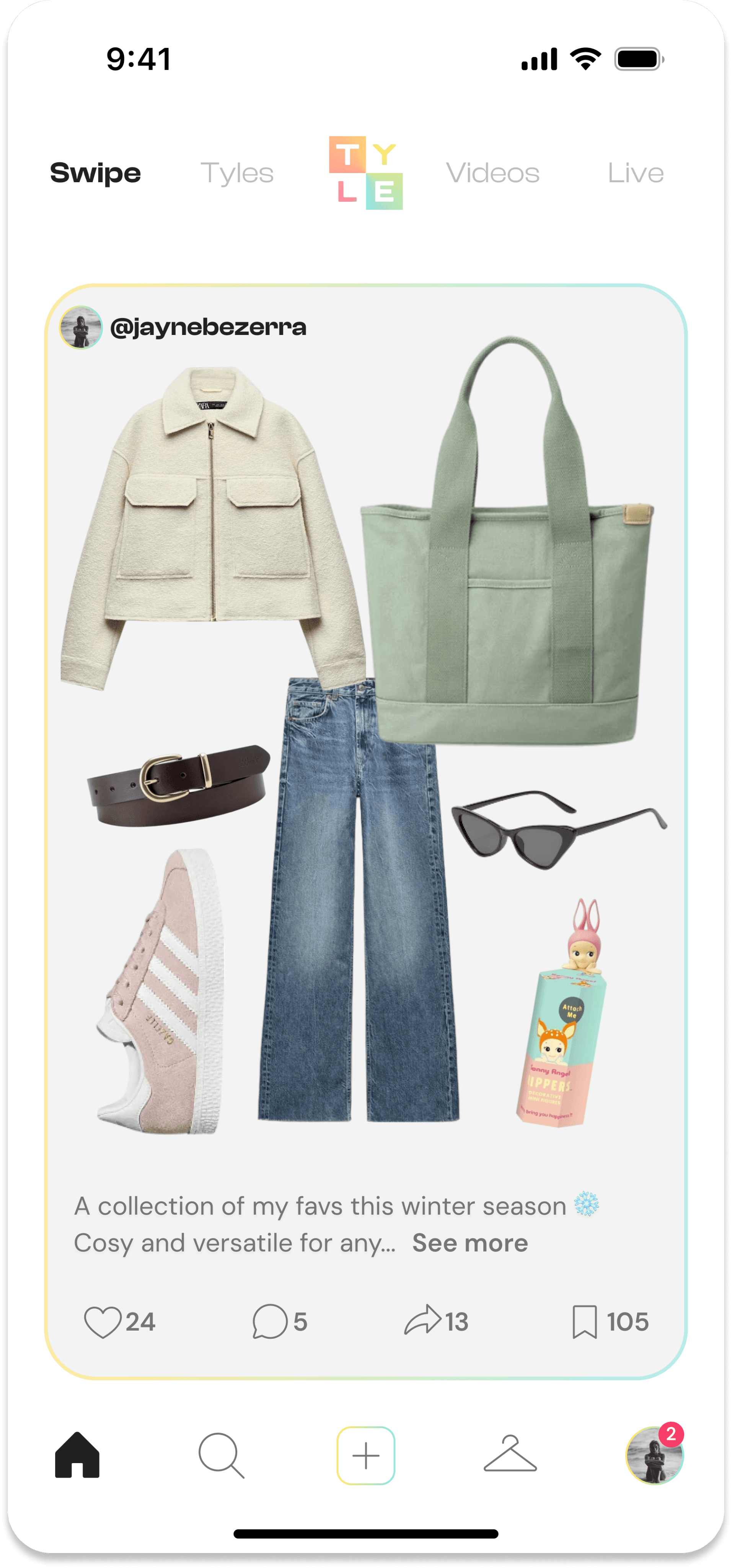
TYLE is a fashion-focused social app concept where users swipe through styled lookboards or "TYLES" for inspiration, similar to Tinder or TikTok. It also integrates ecommerce by linking looks to online stores.
TYLE
Social Media, Fashion
10
2 designers
Problem
The client needed a polished UI to bring their app concept to life and showcase it to potential investors.
We created a Figma prototype and design system translating the client’s vision into an investor-ready interface that highlighted the app’s core features.
Results
Investment Secured
It was a proud moment when the client confirmed that the prototype had contributed to successful funding of the app concept.
Client Approval and Future Development
We received positive client feedback on the prototype and approval of our final designs. The project will now proceed to MVP and development.
Investment secured
1st round funding
Core product MVP identified
Beta product design and dev
Process
Strong Visual Hierarchy: by prioritizing simplicity and strong visual communication, we turned the client’s detailed requirements into a clean, investor-ready prototype.
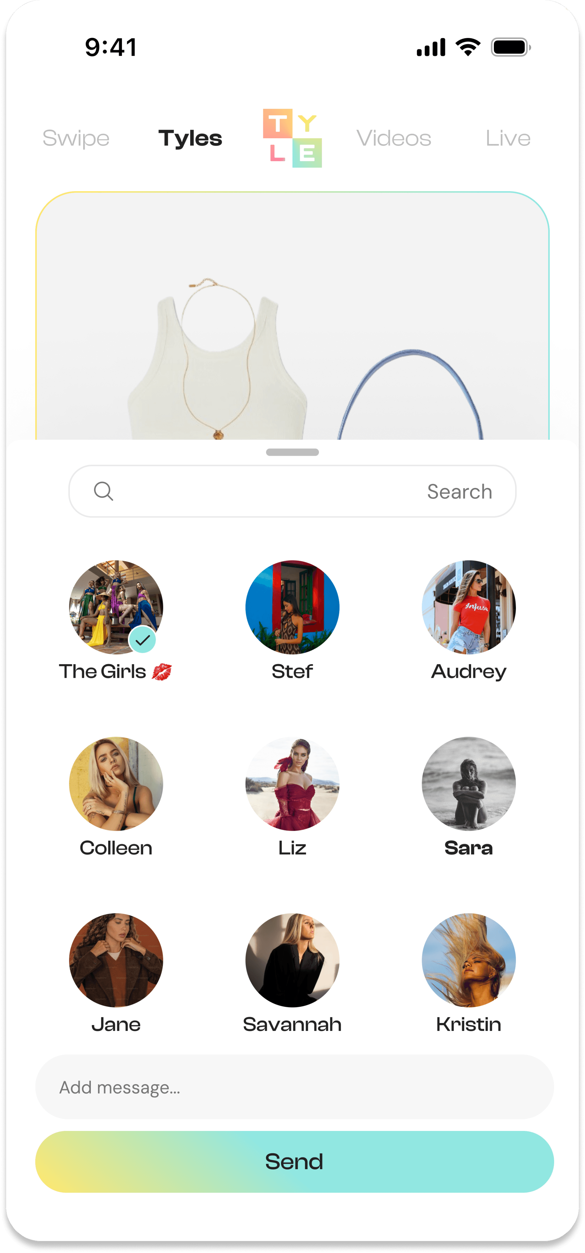
Established Conventions: following familiar UI patterns, we created an intuitive experience bringing key features like swiping through styled lookboards and creating TYLEs to life.
Design System: we built an on-brand design system based on brand guidelines, while I applied atomic design to create consistent, scalable components and streamline the UI workflow.
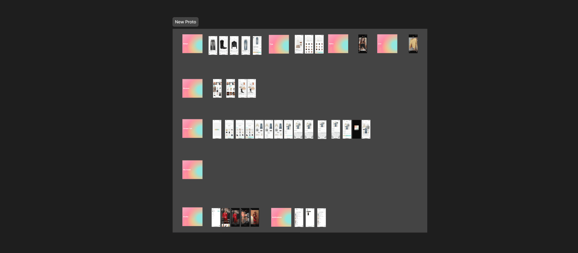
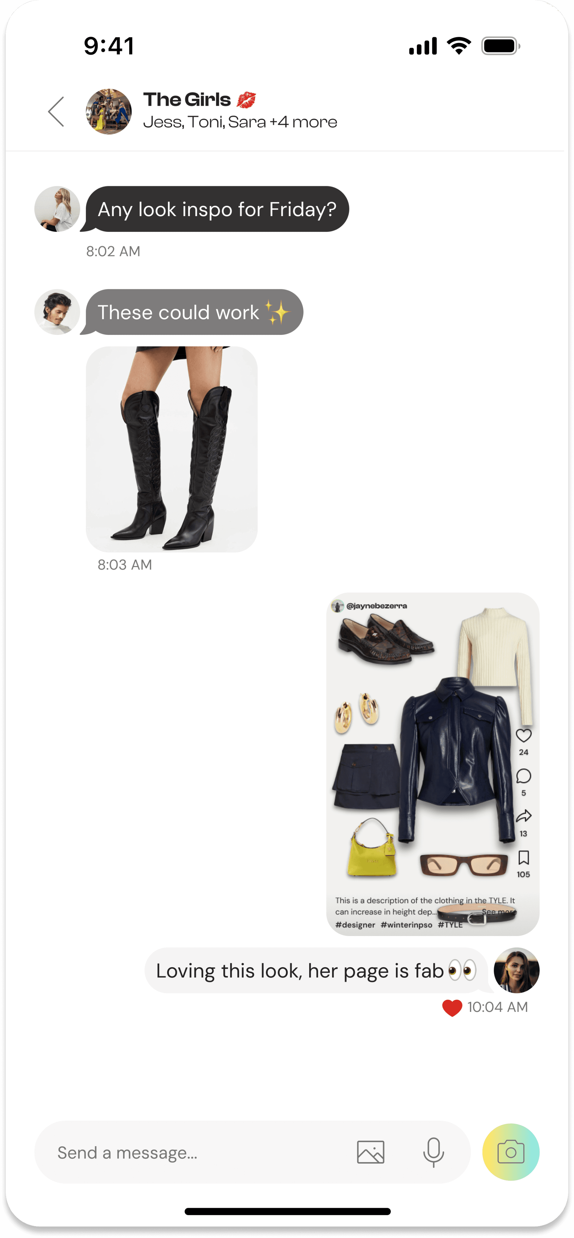
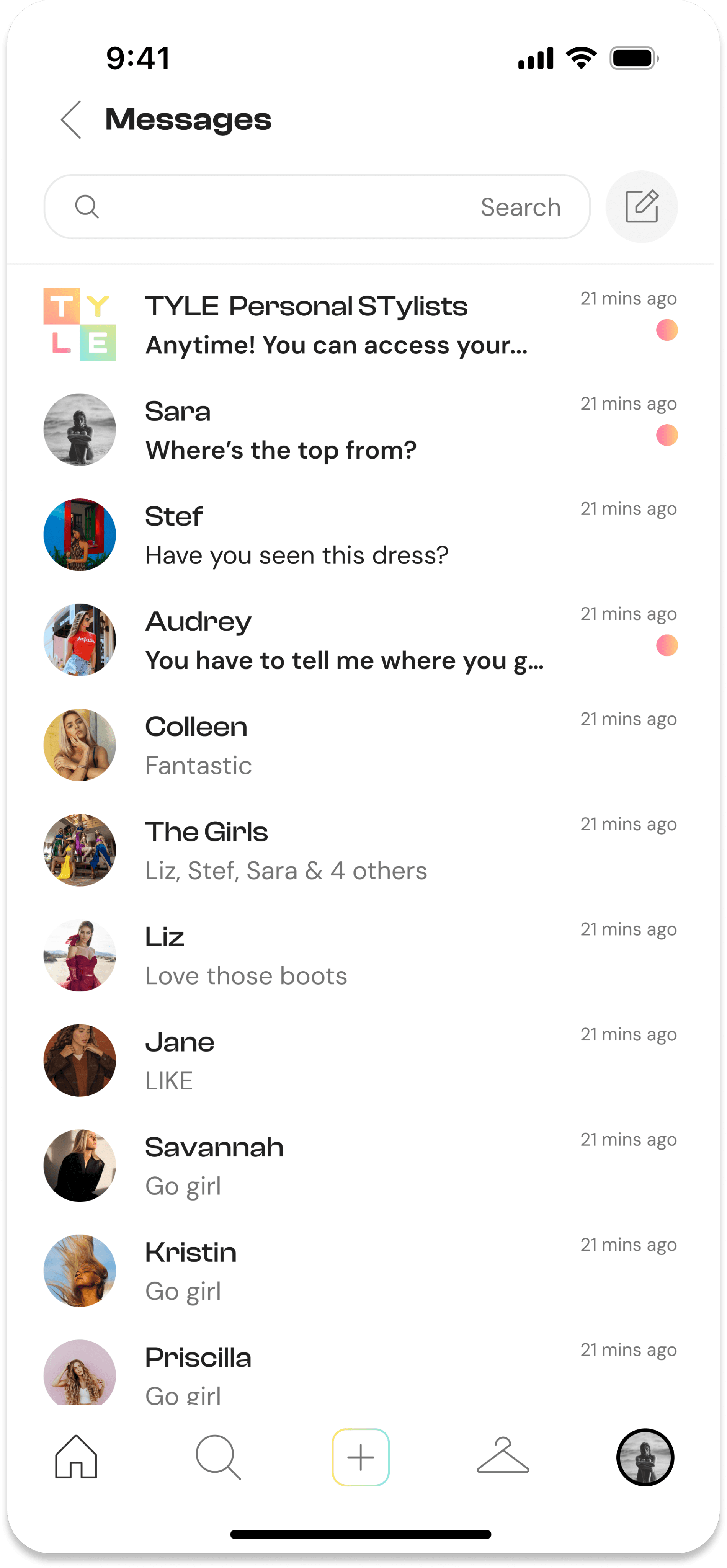
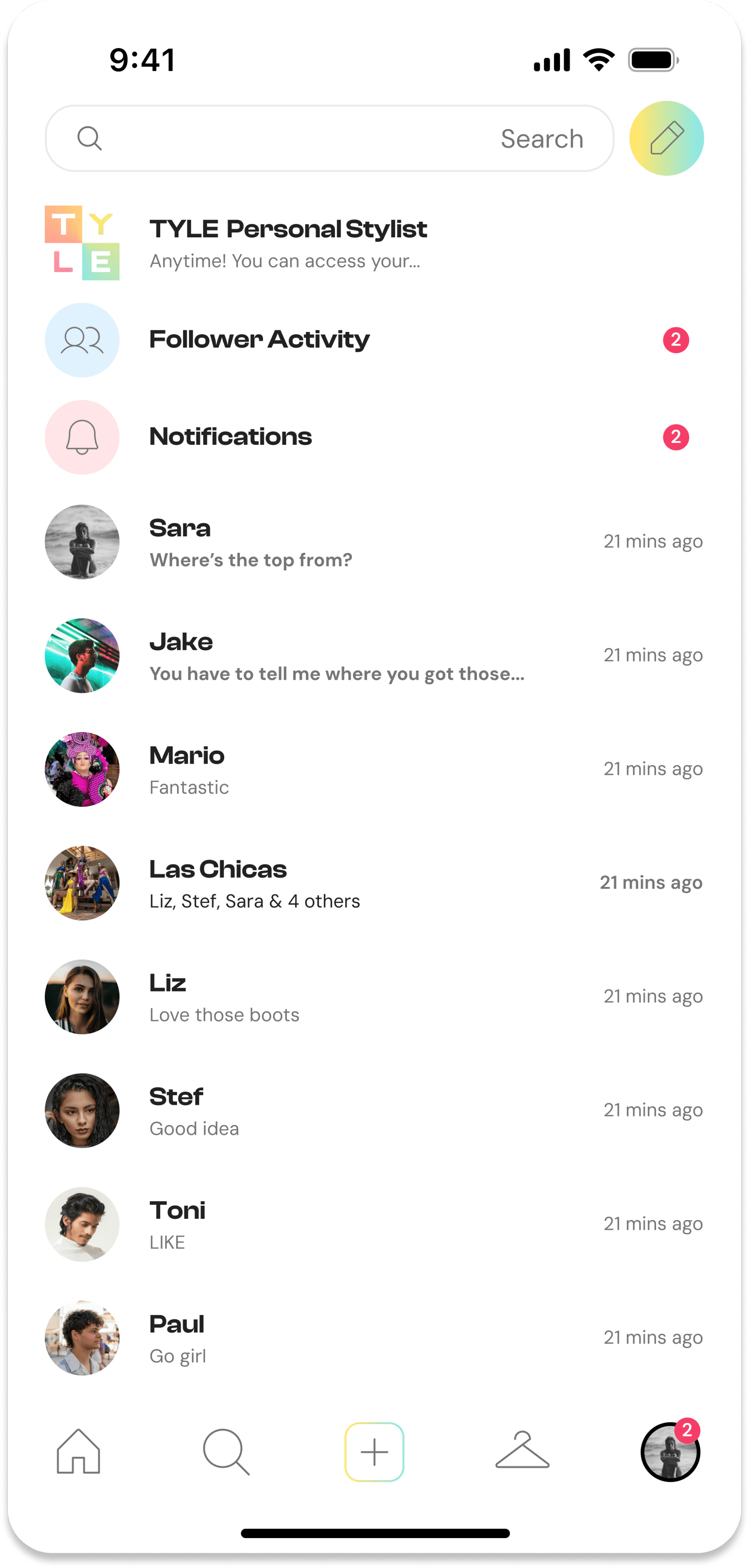
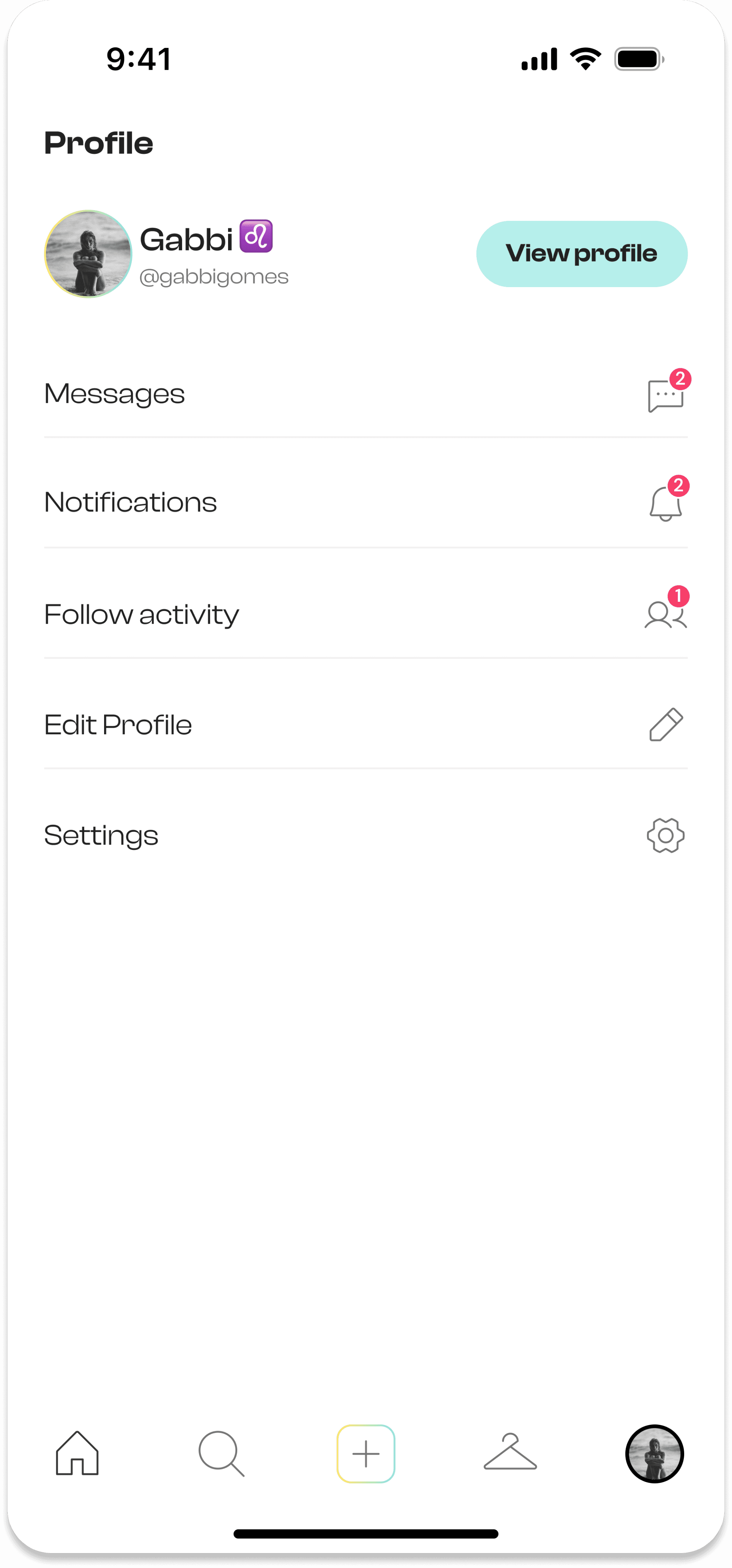
UI Design: I explored, iterated on and delivered high fidelity screen designs for use in the final working prototype, turning the contept into tangible solutions. I focussed on designing for the notifications, follower activity, chat and create a TYLE sections.
First Iteration:
Originally, the TYLE AI Stylist, follower activity, and notifications were grouped under the Messages section, as shown in the first screen below.
After user testing and client feedback revealed confusion and friction, we redesigned the layout by moving these features to a new menu under the Profile section. This improved navigation clarity and streamlined the Messages screen.
Learnings
Navigating Strict Design Briefs: the client required us to follow their brand guidelines closely, so I balanced the constraints with UX principles to create a usable, on-brand solution.
Visual Storytelling: I learned how strong visual design can bring a concept to life and engage users or in this case, potential investors, by clearly communicating core features and value through layout, flow, and polish.
Design Team Collaboration: I gained experience in team workflows, especially the value of design reviews and constructive feedback to improve the overall quality of my work.
Improving Client and Stakeholder Collaboration: I strengthened communication and collaboration with clients & stakeholders by actioning feedback, aligning design decisions with business goals, and adapting quickly to evolving requirements